How to create a custom checkbox with just CSS
Today, I had to create a custom solution for a design requirement. A custom checkbox! It was fun doing it of course and I learned bit more about CSS.
However, I realized that it took me more time to track down the perfect custom solution that was need for me than the complexity of the solution itself. I did not want anything that will make my style sheets more messier and also not for just fancy. Just the right one needed as per the design.
Here follows the code piece. I am trying out this new approach where I add comments in order to explain what a piece of code does or why does it need to be there. ^_^
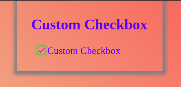
<div><!--Yes, the label should follow the input and id/name is must,in order to associate the label to the input --><input type="checkbox"name="customCheckbox"id="customCheckbox" /><label for="customCheckbox">Custom Checkbox</label></div>
Here comes the fun part of CSS only!
/** First hide the default browser's boring style. **/input[type='checkbox'] {opacity: 0;cursor: pointer;height: 0;width: 0;}/** Makes the label clickable and also not selectable.**/label {cursor: pointer;position: relative;margin-left: 15px;user-select: none;}/** Creates the box for our check mark. **/label::before {content: '';position: absolute;top: 1px;left: -17px;width: 14px;height: 14px;border-radius: 2px;border: solid 1px rgb(25, 209, 25);}/** Here comes the checkmark. **/label::after {content: '';position: absolute;left: -14px;top: 5px;display: inline-block;width: 10px;height: 4px;border-left: 1px solid;border-bottom: 1px solid;border-color: rgb(22, 43, 230);transform: rotate(-45deg);}/** Makes sure the tick is not displayed by default **/input[type='checkbox'] + label:after {content: none;}/** But, only when user checks the box **/input[type='checkbox']:checked + label:after {content: '';}/*** Makes ease of user interaction by addressing the focus state**/input[type='checkbox']:focus + label::before {box-shadow: 0 0 4px 0 rgb(25, 209, 25);}
As you can see, I just used the general style property. This works fine in chrome. I strongly advice to use CSS preprocessors like
SASSso that you do not need to worry about browser specific property prefixes such as-webkit-for chrome. \O/